
UX Designer & Researcher
Research, Ideation, Prototyping,
& Testing.
5 weeks
Our stakeholder wanted us to build a home services eCommerce marketplace that connects millennial homeowners with local home service professionals. They assume these millennials have difficulty in finding reliable and affordable contractors; and lack having DIY knowledge on home improvement projects.
They stressed that the product should provide both the homeowners and the contractors with value, simplicity, trust and transparency. Along with these attributes, they also want the product to be a one-stop solution for finding, review, bidding, scheduling and paying for home service requests.
Our client tasked us with the following:
Develop an on-demand home service platform for millennial homeowners.
Evaluate their competitors, as well as out-of-category apps with qualities that might serve as inspiration for feature development.
Our team felt we need to scope and validate our client’s assumptions about millennials and their relationship to home service projects:
These assumptions were used as our guidance on what to explore in our domain research, and questions to ask for our survey and interviews with millennial renters/homeowners.
As we explored in our domain research, we wanted to get a lay of the land. We started with a competitive analysis. Specifically we wanted to see whether any of the current competitors were successful in being a full-service platform, including some of the features our client wanted: flexible bidding methods, peer-to-peer messaging, a referral system, reviews and ratings, scheduling, and in-app payments.

As shown in our competitive analysis chart, we found that none of the current competitors were successful in being a one-stop solution. We wanted to ensure that this was what our users actually need before we spend our resources building out all of these features.
Once we identified opportunities to explore in the market, we considered how users defined transparency and trustworthiness when it comes to home services. To understand our user's needs, we conducted survey and user interviews.
Through this we wanted to validate our client's assumptions about our users. We found these traits to be true:
Along with these insights, we found most users delved into web platforms like Angie’s list to research and vetted professionals. Contrary to our original assumption, we found that users didn't want a one-stop solution. Instead we discovered users were less concerned about the quantity of features, but rather the quality of their experience on the platform.
These are the qualities users wanted from these platforms:


Overall users address that the current market hasn’t been able to cover these concerns fully. Moving forward we knew we needed to shift our focus onto these needs. With that in mind, we personify our users and created a storyboard based on these needs.
With our insights from our survey and interviews, we developed two personas. Peter, our primary persona has limited DIY experience, and mid-level hiring experience. Alisha, our secondary persona has Mid-level DIY experience and low-level hiring experience.
We pursued Peter mainly because many of our users aligned with his trait of having experiences in hiring professionals and less inclined to do DIY projects.


Peter is a senior developer living in Chicago with his long-term partner in a 3 bedroom condo, where he loves to entertain his friends. He likes to plan ahead on home improvement projects by resourcing from a list of trusted contractors shared with his neighbors and friends. Yet, he finds the list is less than comprehensive and has to search online but takes online reviews with a grain of salt.
This storyboard I illustrated shows his process on installing the Nest thermostat in his home:


This storyboard helped my team and I to visualize the many decisions and steps Peter must take in hiring professionals.
For our problem statement, we asked ourselves "How can we help Peter make educated choices about their home services and the people who provide them?"

While we address Peter's needs, we want to ensure our product encompass the following design principles:

Once we narrowed our focus we jump started on these 4 initial concepts:

This website concept empowers users such as Peter to gain more knowledge with walkthrough videos in how to hire professionals, understand quotes/estimates, plan projects, and do DIY projects.
Instead of Peter needing to search for projects he may not know much about, we conceptualize this website that could be customized based on a Peter's home profile.

This mobile app concept allows Peter to chat with professional and learn about the industry as well. Within the chat, he can quickly access on a construction or maintenance terminology.
Considering the challenges with connecting with vetted home service providers, we created this website concept that would utilize Peter’s network of friends and family and provide a way to connect to trusted providers in that network.

After we develop these 4 concepts we begin to evaluate how feasible these concepts are for our stakeholders. We needed to prioritize which main concept was most valued by users like Peter and most feasible to build as shown with our priority matrix.

We selected the features the most feasible and the most users need (the top right area of the matrix). We decided that we needed to shift away from the 'Educational' concept because creating these video or article content are harder to implement and users don't really desire.
We conducted initial concept testing with users like Peter to pursue the strongest concepts and which features to implement into our MVP. Here are the main elements we prioritized as shown in this diagram:

Overall, we focused on the 'Personalized' concept as the foundation for our MVP. We included the 'Approachable' concept and the 'Trustworthy' concept as our additional features.
HomeBio is a home service website that helps to manage and track users' home maintenance projects while informing them throughout the process.
The prototype link below demonstrated how Peter would use HomeBio to check his reminders for upcoming or overdue home repairs and chatting with the contractor.
We developed this site map below to help us organize our features for projects, reminders, search, home details, and chat box.

Let's see how users like Peter could take advantage what HomeBio offers.....
In the pre login page, Peter can use the search function. But he will need to set up an account to access the full website. If he signs up, he can manually or import his home's information and data from Zillow's database.

Personalize reminders for maintenance projects are pulled by the platform Peter's home data. An example shown below is alerting Peter that he has an overdue HVAC system check. This is crucial since there's upcoming cold severe winter weather.


HomeBio takes the Peter through the hiring process starting from describing the job to requesting a quote to hiring. If Peter creates a project from a reminder, the system will auto fill as much of the details as it can and let Peter edit anything he'd like. After filling out the project details Peter will be presented with options for professionals to request a quote from, prioritizing professionals who have been recommended by Peter's friends.

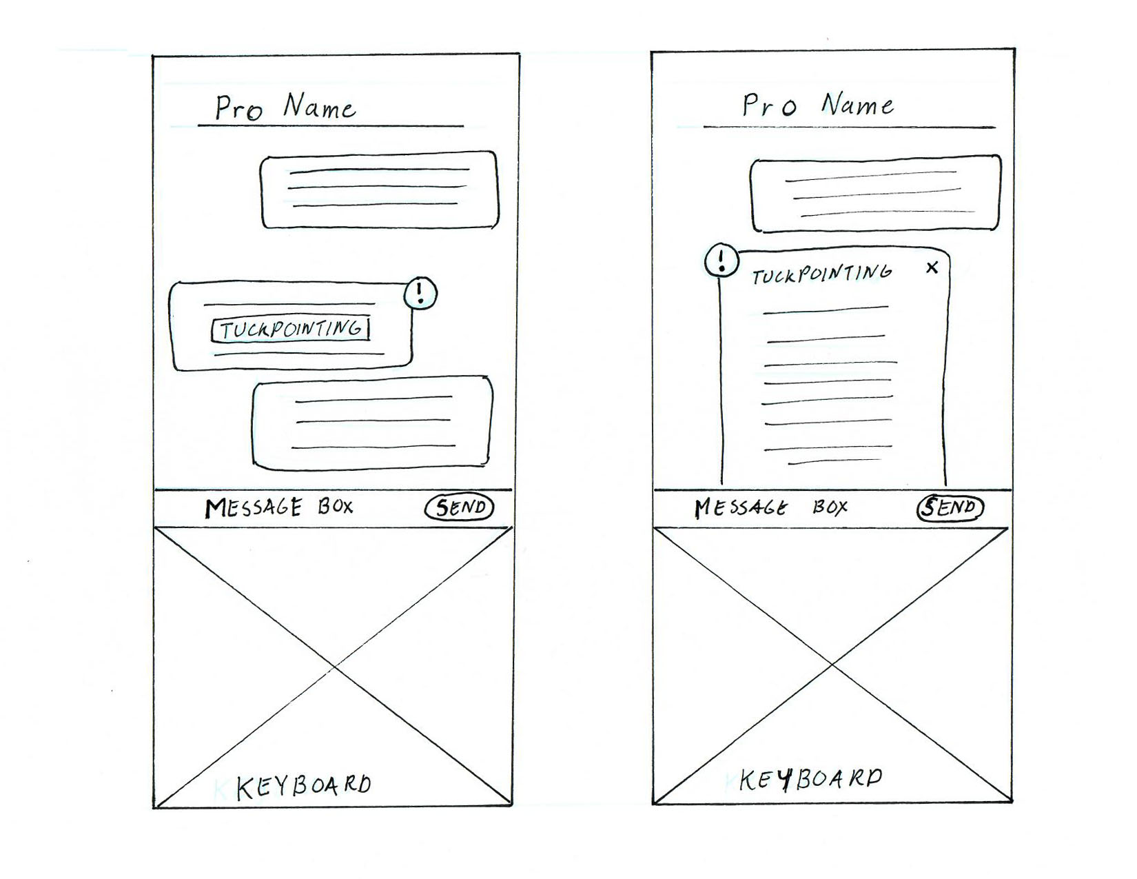
Peter can access the chat box by clicking on the "Chat with Pro" button. In the chat, he can directly message with a professional, and save important documents or photos which links to the project. He can also learn any industry terminology by clicking on the word and an information overlay opens.


As we tested our MVP, here were the feedback and results from our users:
But we also factored in the next steps our stakeholder should consider:
I developed these high fidelity screens by envisioning Homebio's visual brand language. I also made adjustments on the interface based immediate changes needed from our testing. For a closer view you find them here.


At first, I found this project very challenging since the home service platform was overly oversaturated. What I found fascinating while talking with users, l realized there were gaps that these existing home services haven't really addressed. Especially on the hiring level experiences with our users.
I like that our team took a unique approach by customizing the platform based on our user’s unique living situation. Our users really enjoyed the reminder features, many have mentioned this could alleviate future expensive repairs.
But I felt our problem scope was still broad and could have been streamlined further. This was due to our time constraint and group think. Also, I would have encouraged our team to filter out some of the smaller features during our convergent. These small features caused some hurdles and made our usability testing more complicated to test. I feel this may have caused confusion with our users and not making the hiring professional process much more fluid.
